Revise and Resubmit
One of the phrases in my day job vocabulary is revise and resubmit. It means the work has promise, but it is not quite there yet. The ideas are good. The foundation is solid. But something needs to change before the work really succeeds.
It turns out the same thing happens with quilts.
XOXO was one of the designs that came out of the early surge of energy when I formally committed to the 100 Quilt Project. Once I made that decision, the ideas came fast. It felt a bit like opening the floodgates. I had pages of sketches, color combinations swirling in my head, and an eagerness to just start making things.
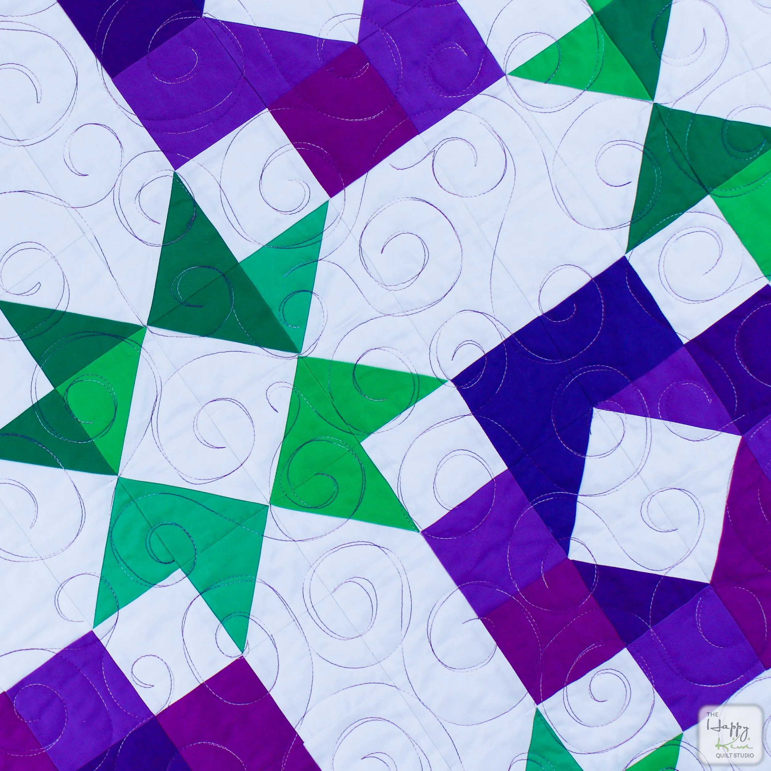
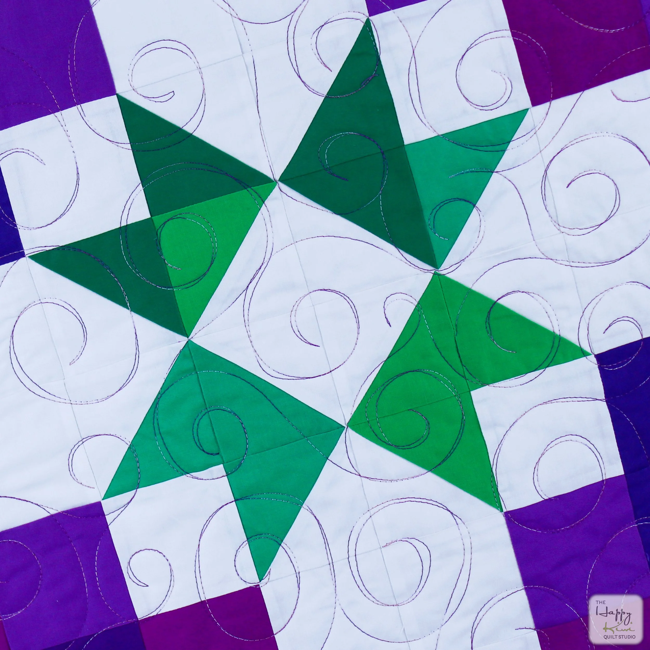
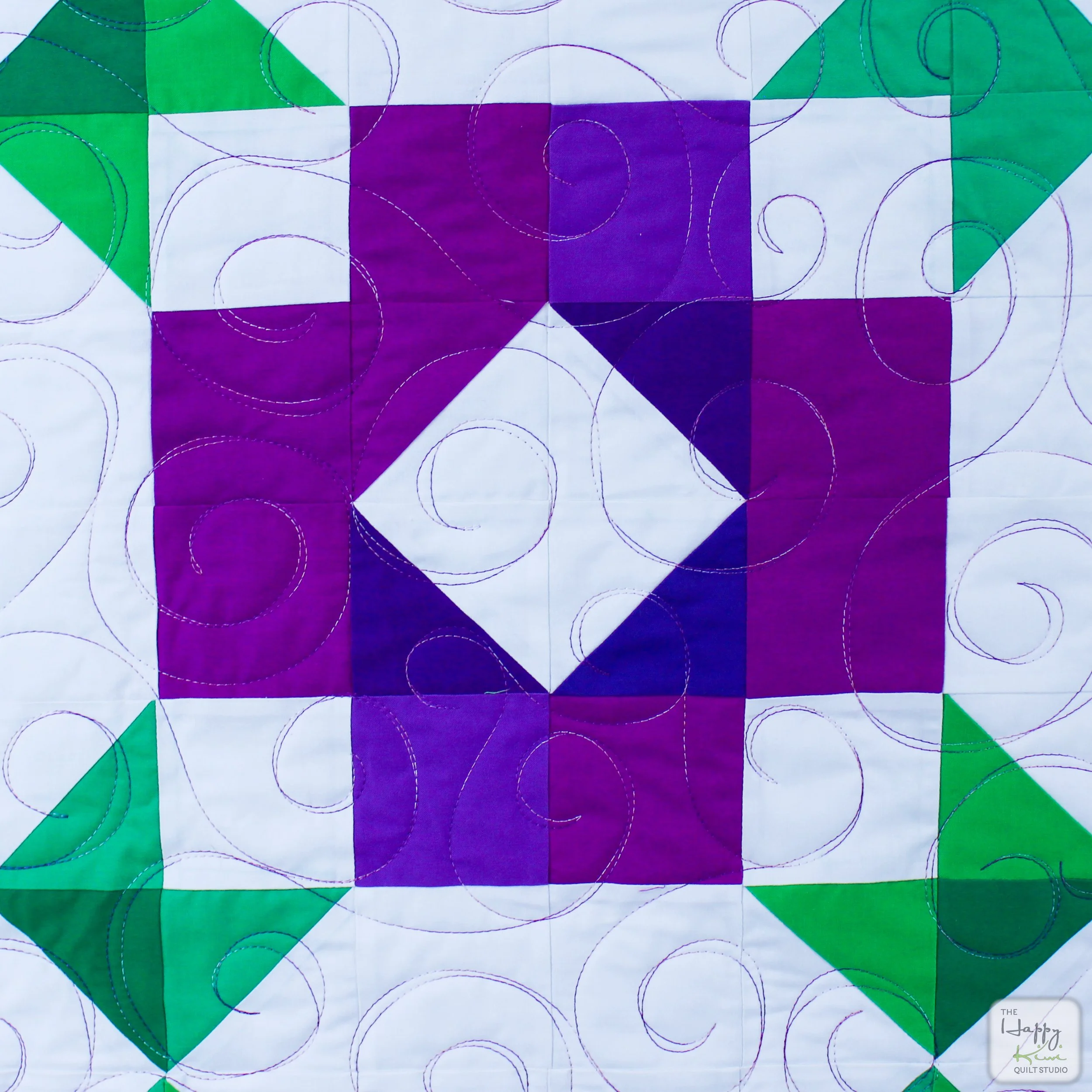
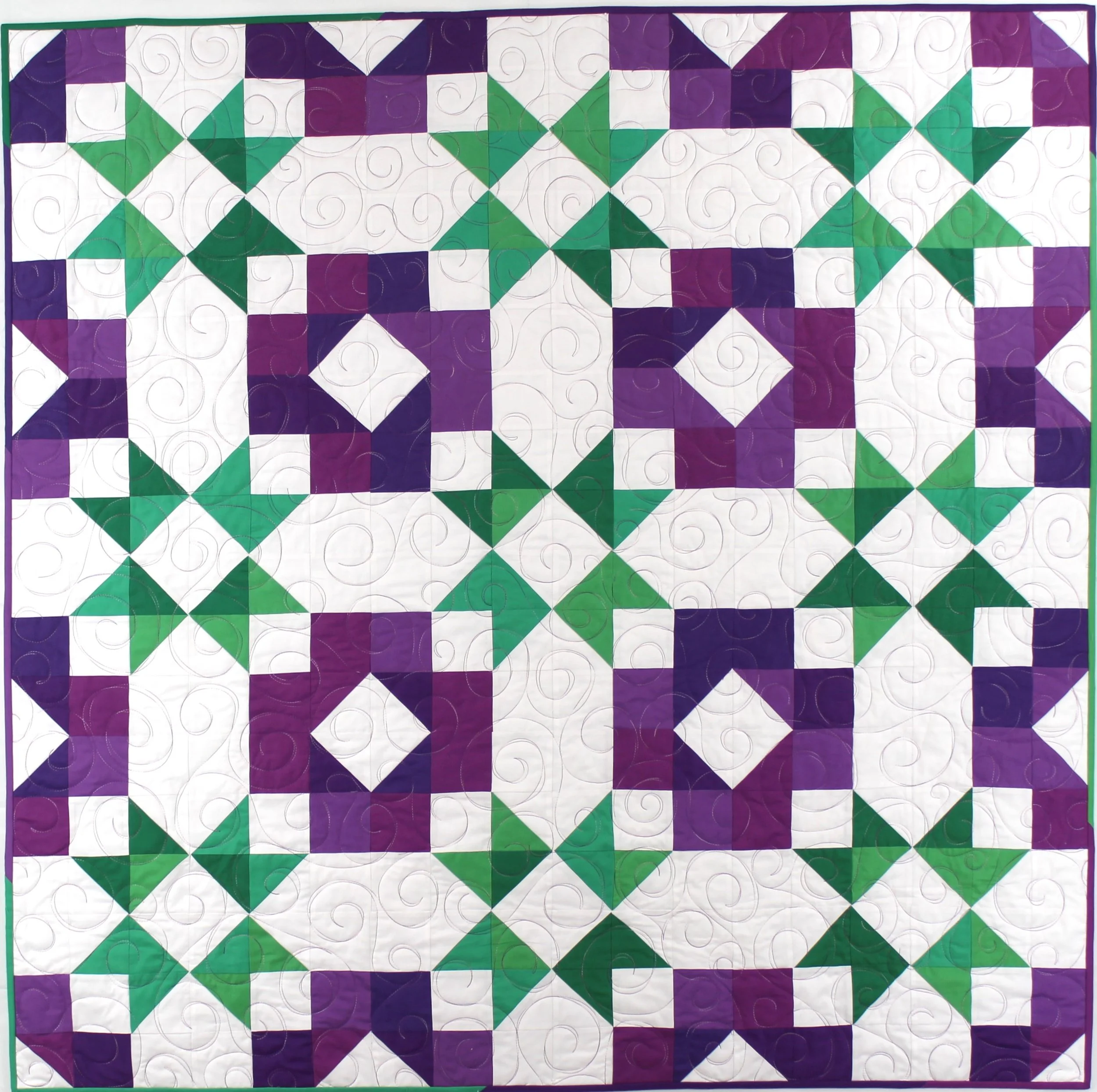
The idea for XOXO was simple. I wanted a quilt built around the classic X and O motif. The shapes were straightforward and the construction looked quick. At that stage, I was also trying hard to work from what I already had on hand, so I went to the resource center and started pulling solids. What I had enough of was green and purple. I always keep a bolt of white around, so those became the colors.
Looking back, I think I had two ideas competing in my head. One was the XOXO theme, hugs and kisses. The other was something closer to violets or an abstract flower with little leaves. The result landed somewhere between the two.
I made the quilt. It was perfectly nice. Pretty, even. But it never really excited me.
The quilting did not help. I used a variegated purple thread and quilted freehand spirals across the whole surface. It showed up strongly on the white background and did not really connect with the theme or the design.
A friend of mine loved the quilt, so it quickly became hers. The pattern went into the project and I moved on to the next design.
But over time, it kept bothering me.
The name was XOXO, a nod to hugs and kisses, and the colors did not support that idea at all. If anything, it should probably have been named something related to violets. And the O motif did not read clearly. The shape was there, technically, but it took too much visual effort to see it.
Eventually I decided to remake it.
The timing helped. It was February, and Valentine-themed everything was everywhere, which nudged me back toward the original intent of the design. I opened the file and started tinkering.
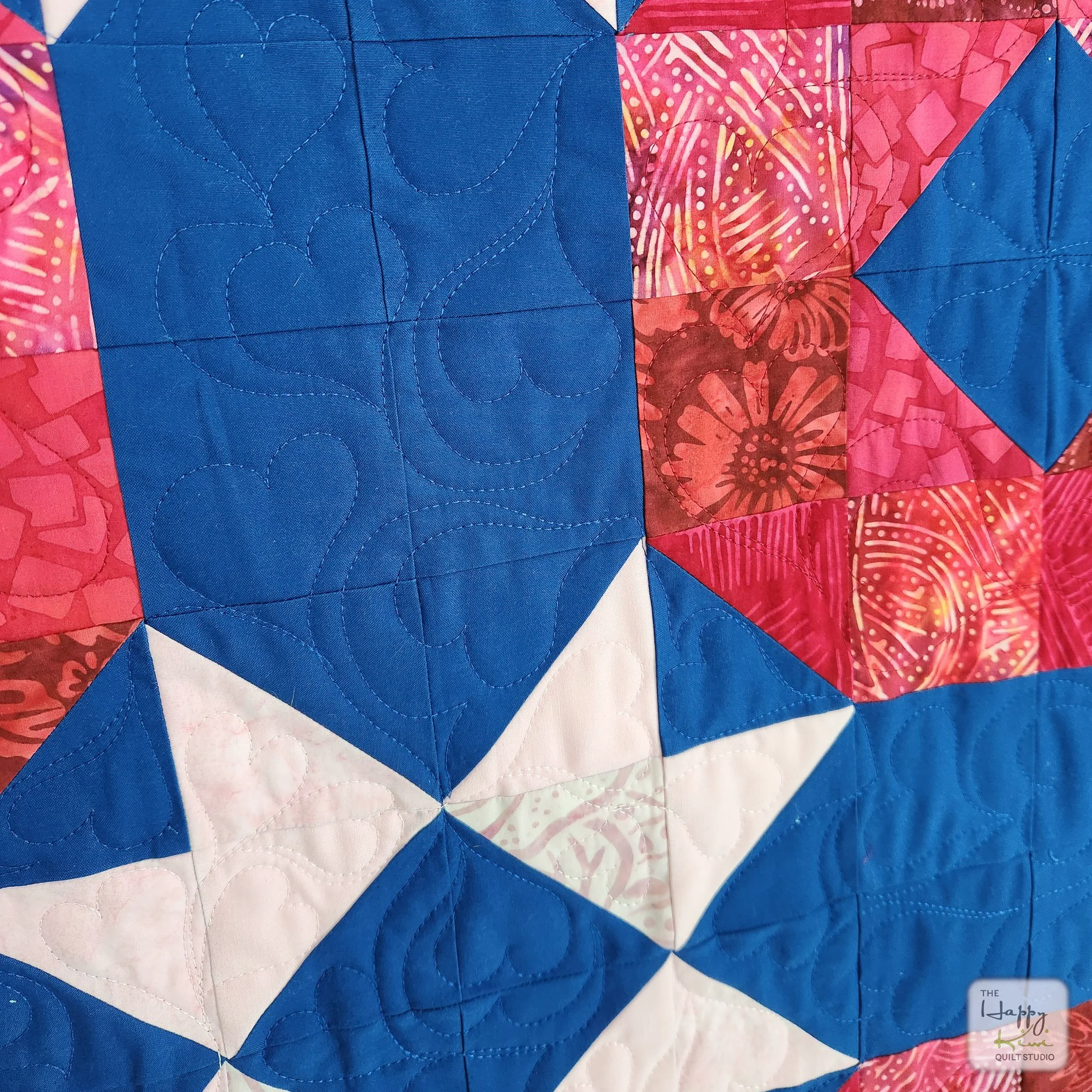
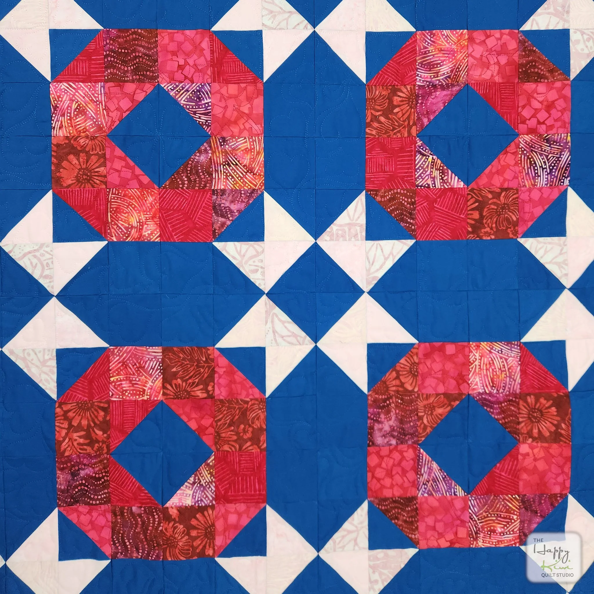
The fix turned out to be surprisingly small. I added a half-square triangle to the block. All of a sudden, the O popped out. There it was. The hug.
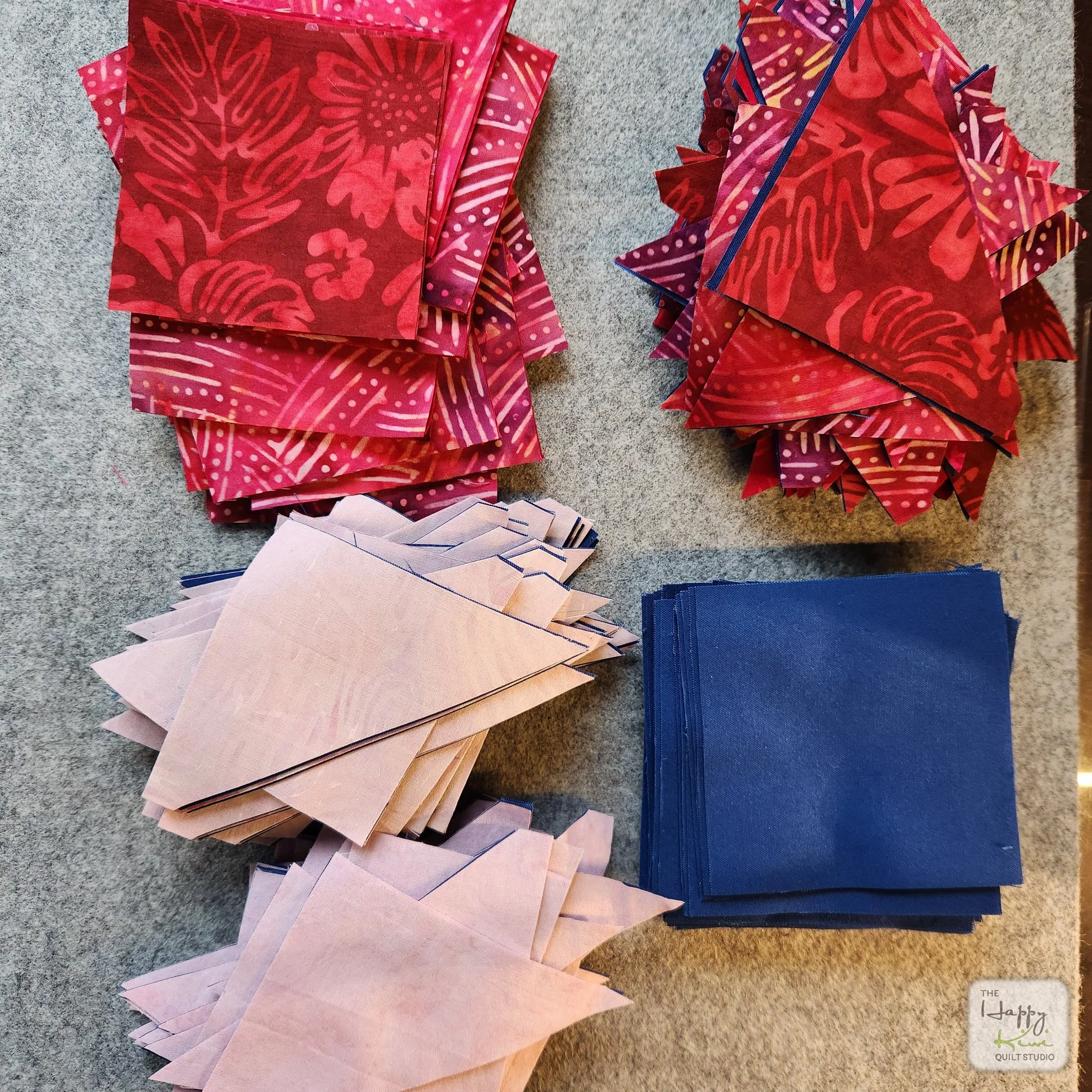
The X shapes still worked perfectly, so I left them alone and focused on color instead. This time, I leaned fully into the Valentine palette. I chose pinkish-red batiks for the O shapes and soft pink batiks for the X blocks. For the background, I switched to Kona Prussian Blue, which made the reds glow.
Prussian Blue has quietly become one of my favorite background colors. It changes personality depending on what you put next to it. Against the reds and pinks it creates a deep, dramatic contrast.
Since I was already redesigning the quilt, I briefly experimented with changing the block construction to use larger pieces of the batiks. In the end I abandoned that idea. Batiks are wonderful for color and movement, but their patterns can get busy in large pieces. Keeping the 9 patch structure allowed the fabric to break up into smaller units so the batiks function more like shifting color rather than dominant prints.
Then came the quilting. The first version had been a little lazy. One thread. One edge-to-edge spiral. Done.
This time I slowed down and matched thread colors to the areas of the quilt. The quilting is still an all-over design, but now it is freehand looping hearts. They echo the XOXO theme and blend into the quilt instead of competing with it.
At one point, I paused and asked myself a slightly philosophical question. Should the new XOXO replace the original one in the project? The order of the quilts in the 100 Quilt Project does tell part of the story of how my design work evolves over time.
It felt like a fair question.
Then I remembered something important.
It’s my portfolio.
I can do whatever I want.
So the new XOXO took the old one's place. The earlier quilt still exists, of course, and I have included it here so you can see where the design started and where it eventually landed.
There is also a photo in this post that makes me smile every time I see it. It is a pressing mat piled high with carefully cut fabric pieces. I love the cutting stage. Doing the math, calculating the pieces, stacking everything neatly, and then assembling the quilt top with nothing left over. It is strangely satisfying. Possibly a little obsessive.
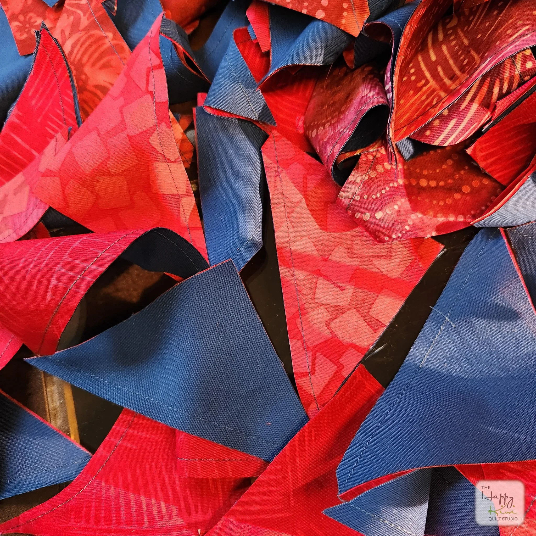
There is also a photo of the tumble of half-square triangles spilling out the back of my sewing machine while chain piecing. When you look at it just right it almost looks like modern art.
And of course there is a photo of Gracie, who appears whenever a quilt hits the floor for photography. She likes her cookies.
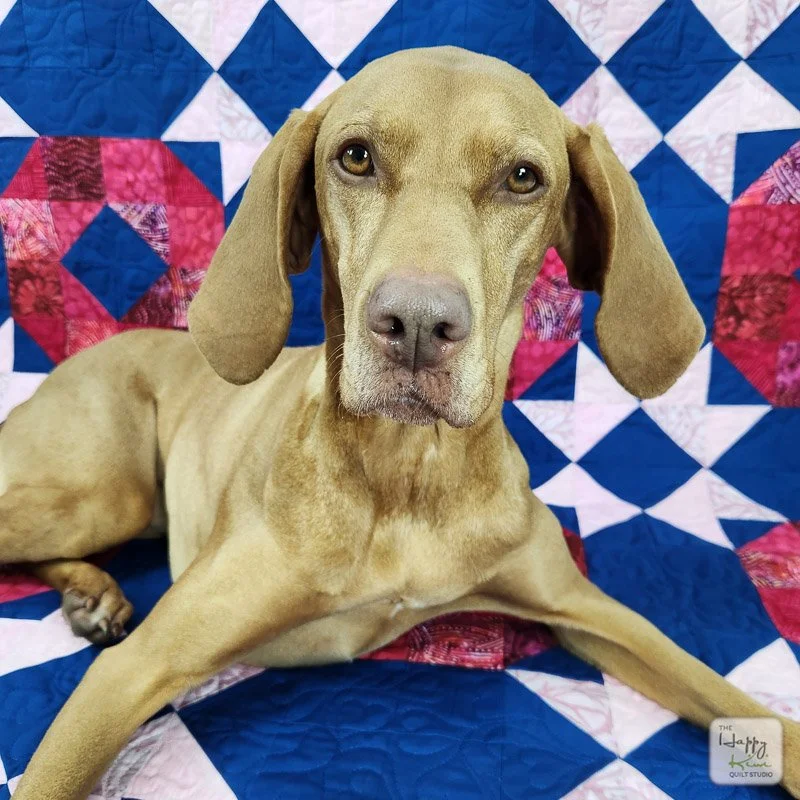
The obligatory photo of Miss Grace, doing her thing.
Revise and resubmit… The first XOXO had the seed of a good idea, but it never fully worked, and that always nagged at me. This version finally does. The XOXO in the portfolio now feels like the design I wanted it to be, and I like having it there.